
Cunard 4 Queens Gin
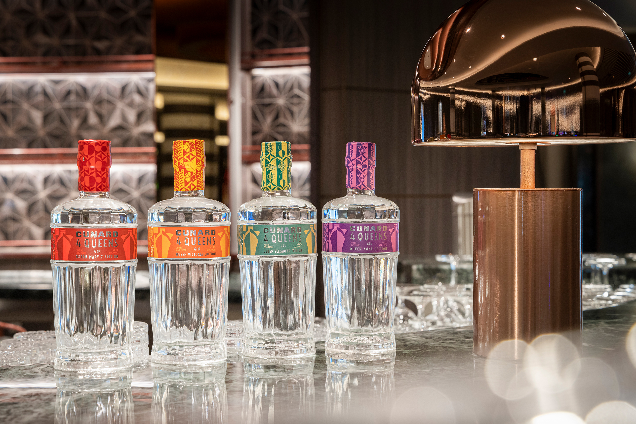
A four edition gin range, with labels built from the botanicals inside each bottle.
Challenge
Cunard has made its own gin since 2017, one edition for each Queen, each built around a region and the botanicals that grow there. The arrival of Queen Anne in 2024 made it four, and the range was renamed Cunard 4 Queens. A new bottle came with the name: tapered like the bow of a ship, the crest embossed into the base, etched detailing running through the glass.
The studio was brought in once the bottle was designed, so the shape was fixed before we started. The etched detailing left a single narrow band for the label, and everything the range had to say had to fit inside it: the flavour, the botanicals, the ship, the brand. A small, difficult canvas, and a brief the studio had no say in setting.
Approach
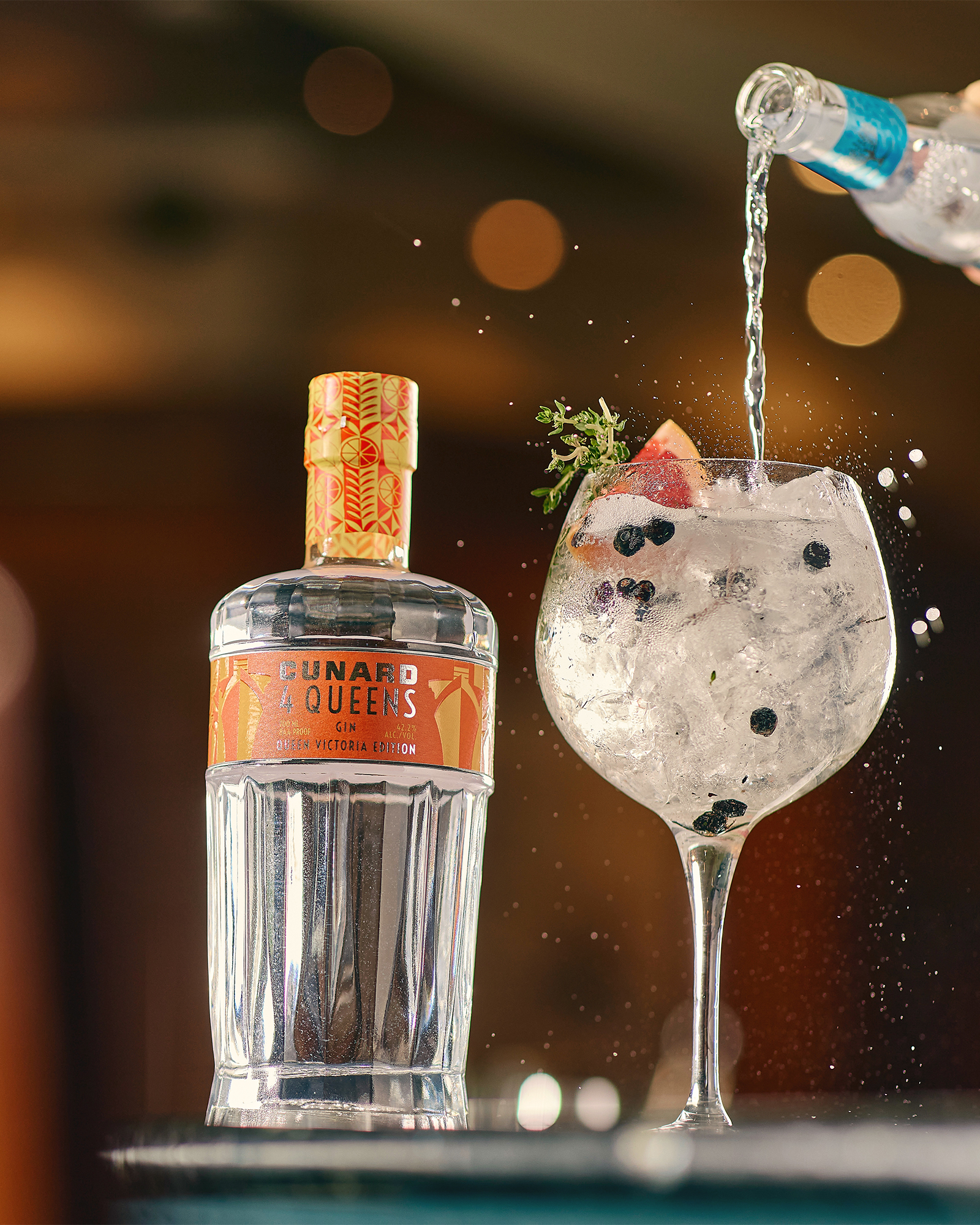
The studio developed several routes. The geometric concept I proposed was selected, and I art directed its development with the brand team and a designer in my team. Each label became a duotone pattern drawn from that edition’s own botanicals, with the ship worked into the pattern and Cunard branding held bold at the centre. The Queen Anne edition celebrates the British Isles, so its pattern is built from milk thistle, heather, sea buckthorn, blackcurrant leaf and Queen Anne rose petals. Colour carries the dominant flavour, which lets the four read as one family across a back bar while each bottle still holds its own on a shelf.
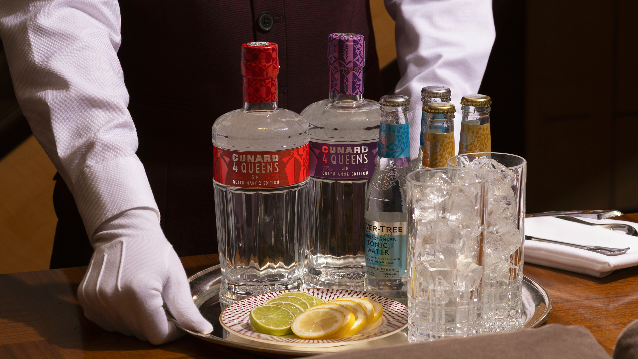
I worked with the printers on the finish. The labels are printed on a rough textured stock, with the branding in silver foil and a spot varnish on the lighter colour in the pattern to add shine, depth and contrast. A neck wrapper repeats the botanical pattern over the closure.
Outcome
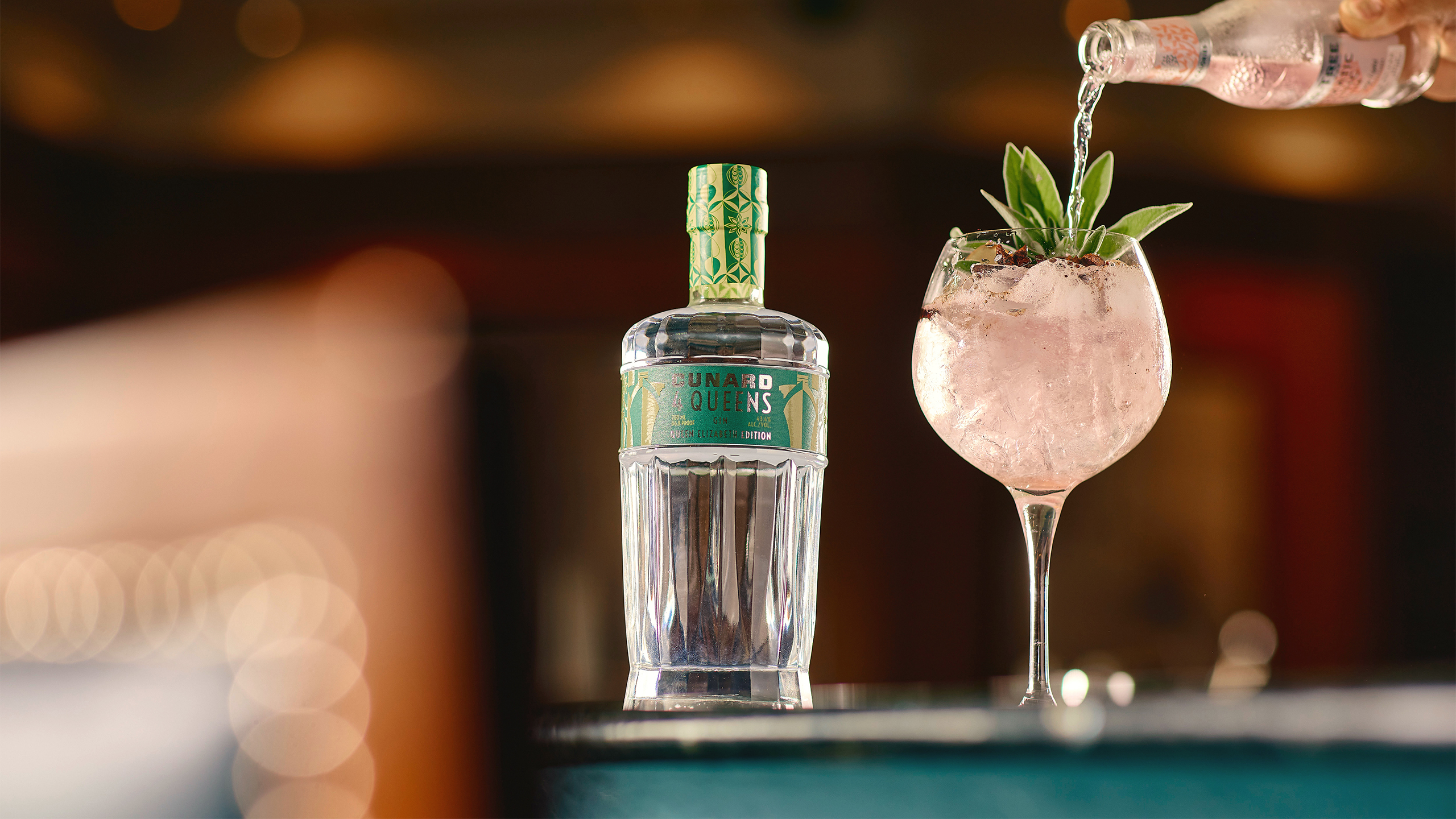
Four editions across the fleet, and a range that works as a set and as single bottles.