
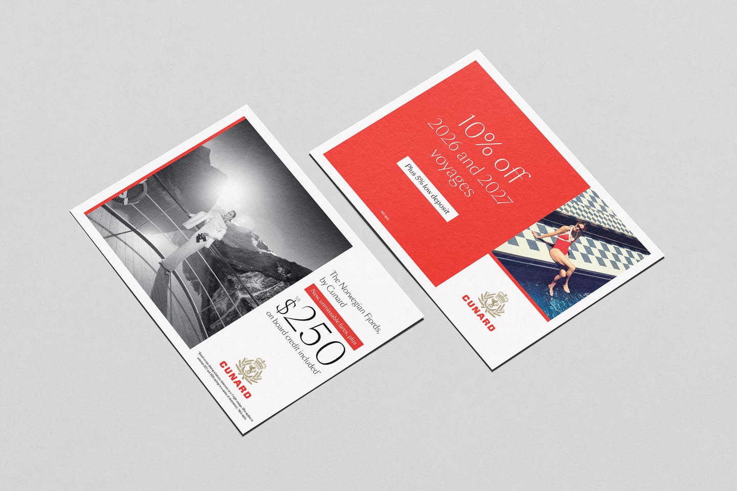
Cunard Promotions
Campaign design across print, digital, CRM, social, trade and onboard, built from one set of masters.
Challenge
A single promotion lands everywhere. Direct mail, email, paid social, web, trade assets, onboard collateral. Each format has its own constraints and its own deadline, and much of the work is produced by other designers and outside agencies. The difficulty is not making one asset well. It is making sixty of them, through several pairs of hands, and having every one of them look like Cunard.
Approach
I wrote the promotional guidelines the brand works to.
They define the two kinds of promotion, tactical and longer term, and set the balance between offer and imagery for each. They fix the elements that make a Cunard promotion recognisable: the red anchor line that appears in every execution and ties the layout back to the logo, a six by six grid that divides any format into offer, image and logo, exact line weights and margins for print and digital, and a photographic direction built around a single guest as the focal point. The guidelines exist because brand elements were being misused, and they were written to stop that happening.
Every campaign is then built from one set of masters held in Figma. Five master layouts cover the formats used most often, and each is composed from the same shared components: the offer stack, the image, the logo, the legal line and the anchor line. A change made once moves through the whole campaign. From the approved masters, an automated workflow I built produces the full rollout of more than sixty finished assets, applying the same grid, margins and spacing every time. The process is repeatable rather than generative, so the same masters always produce the same assets. Creative judgement stays with the designer and automation takes only the repetition.
Motion is made deliberately rather than left to chance. Paid channels will animate a static asset on your behalf, and the result is rarely on brand, so I produce the animated versions myself, using AI alongside After Effects to build the motion out of the approved campaign image. The movement gets the same consideration as the layout.
Outcome
One approved set of masters now produces a full campaign rollout of more than sixty assets.
The guidelines are used by the studio and by external partners, and promotional work reads as one brand across every channel it appears in. On the Norwegian Fjords campaigns, the video creative ran at click through rates above 1.3% with cost per sale close to benchmark, so stronger creative lifted engagement without raising acquisition costs.