
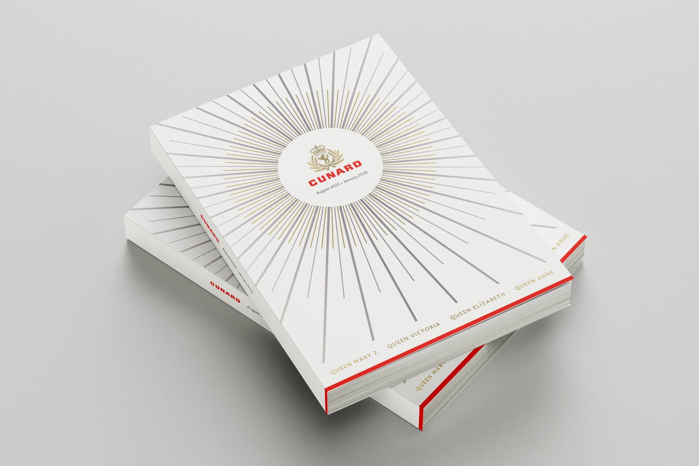
Cunard Brochures
Cunard’s flagship publication. Around 180 pages, produced twice a year across four ships.
Challenge
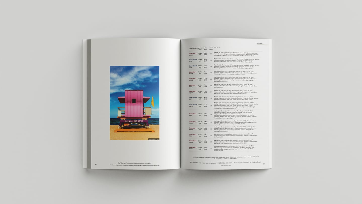
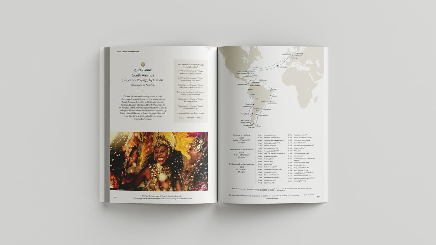
The brochure is the most substantial thing Cunard prints, and for many guests it is the first physical thing they hold. The front sells a feeling, through layouts that introduce the brand and the four Queens. The middle presents the hundreds of voyages available to book, carried by destination photography. The back is functional: deck plans, voyage calendars, fare and booking information. Around 180 pages, and every date, port and cruise code has to be right.
Approach
I lead the brochure end to end.
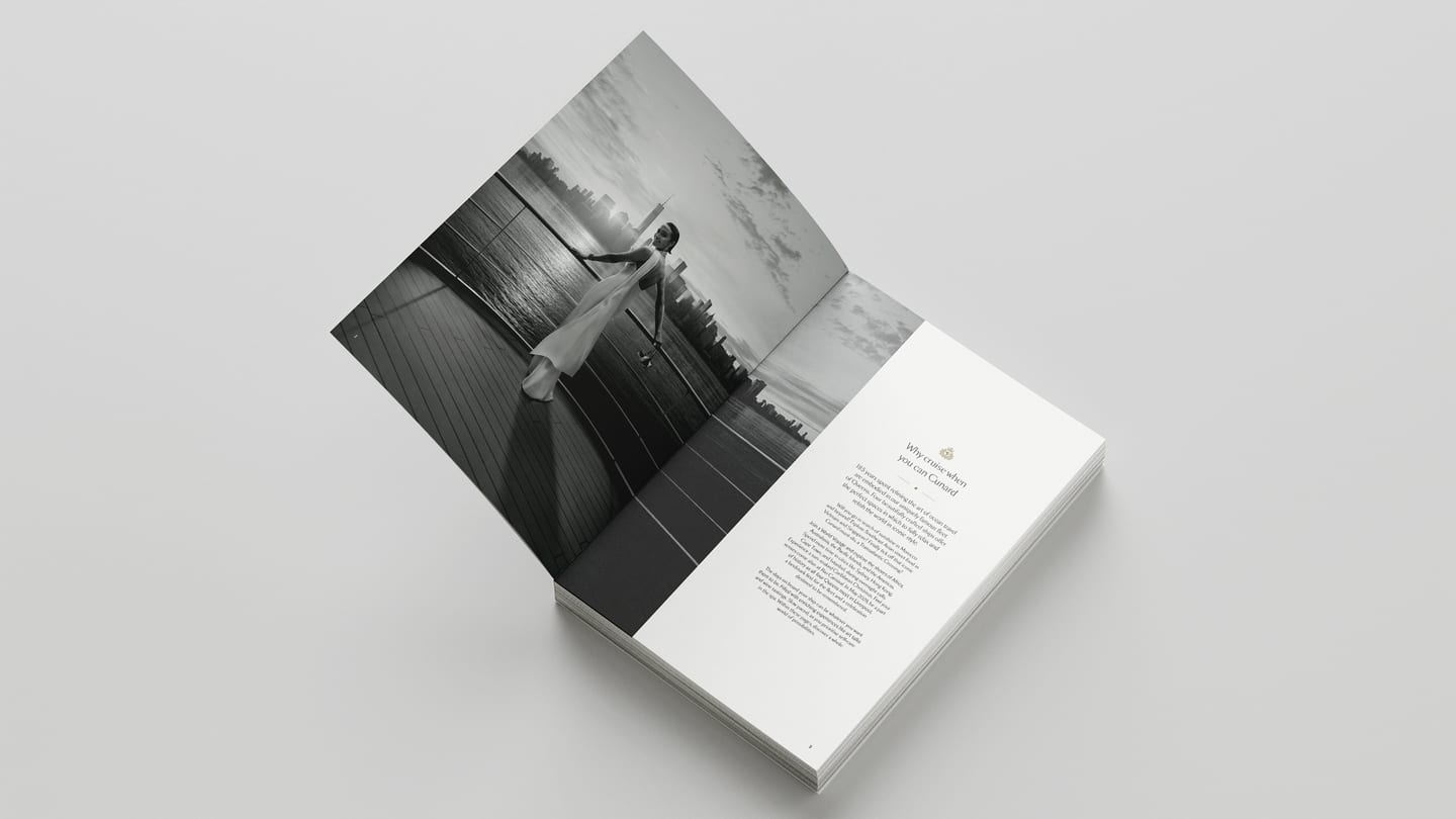
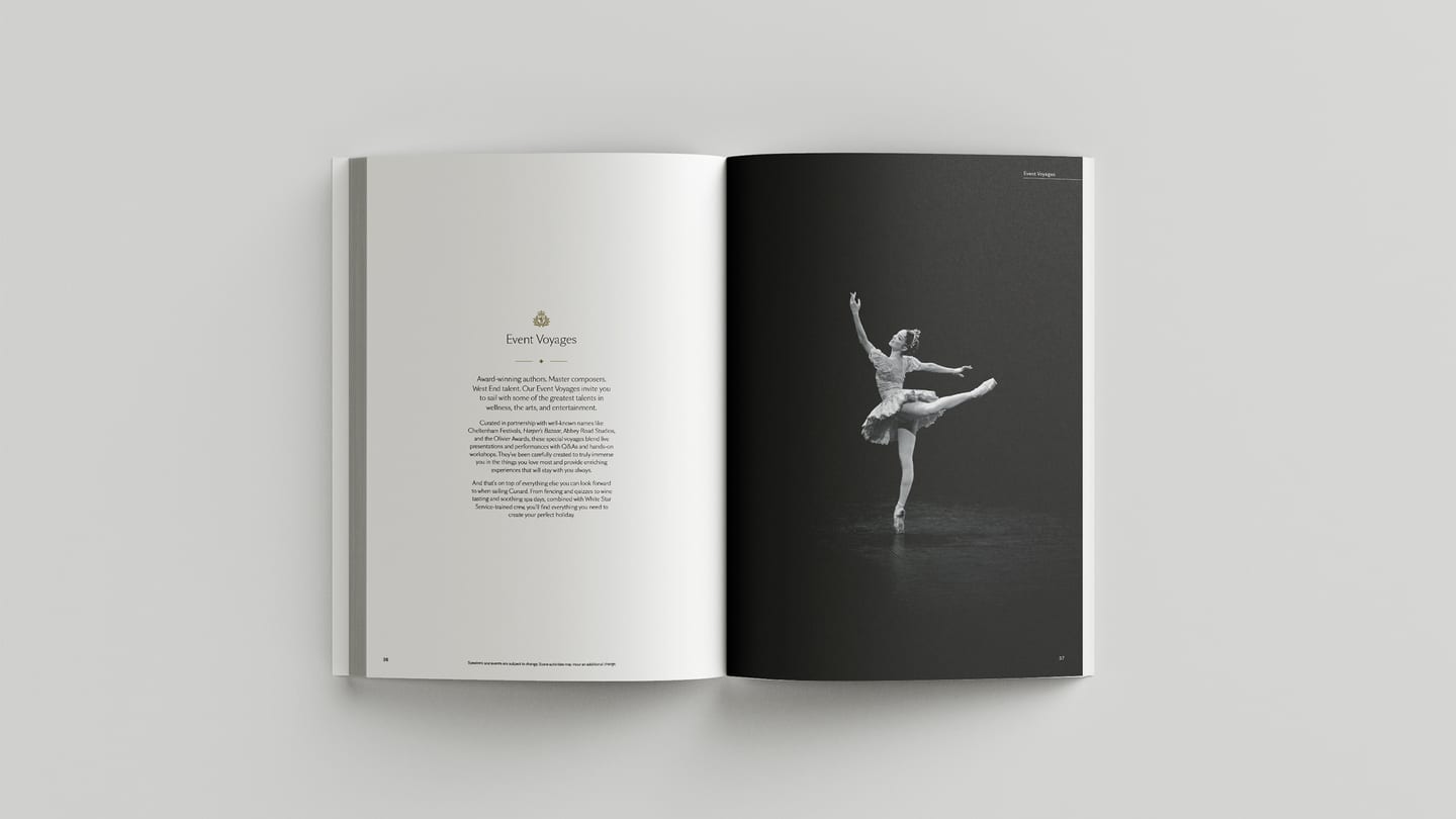
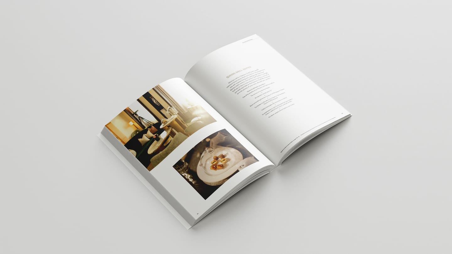
Art direction, image sourcing and curation, layout and pacing across the whole publication, stakeholder amendments, proofing and print approval. The editorial pages set the register, with generous white space, restrained typography and photography chosen to set the pace rather than fill the page. The cruise details pages are held to the same standard, using a typographic system that keeps dense information legible without dropping the tone.
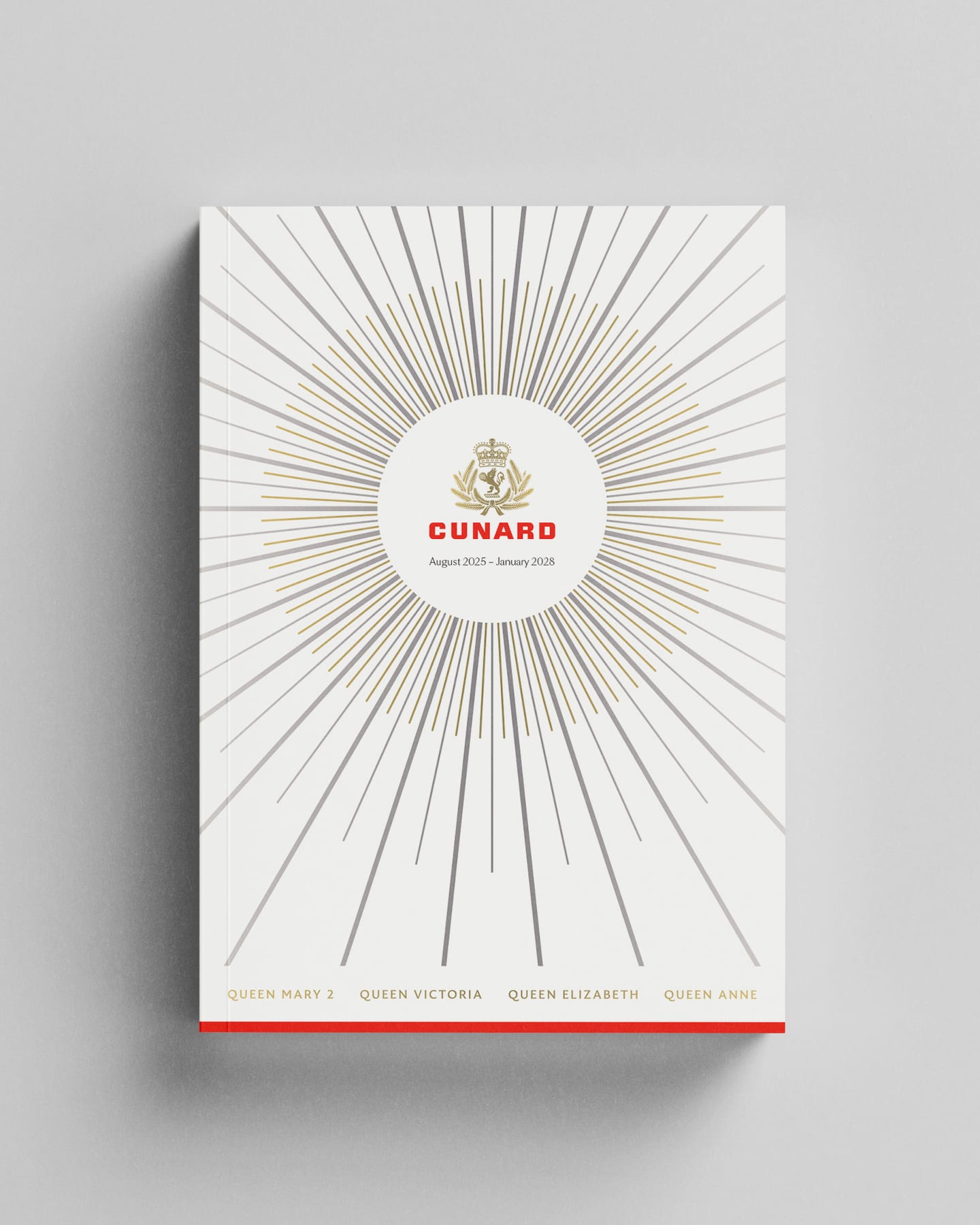
The cover is where the brochure has to earn its place. Ours is an art deco pattern, embossed and foiled, in a category where almost every competitor leads with a photograph.
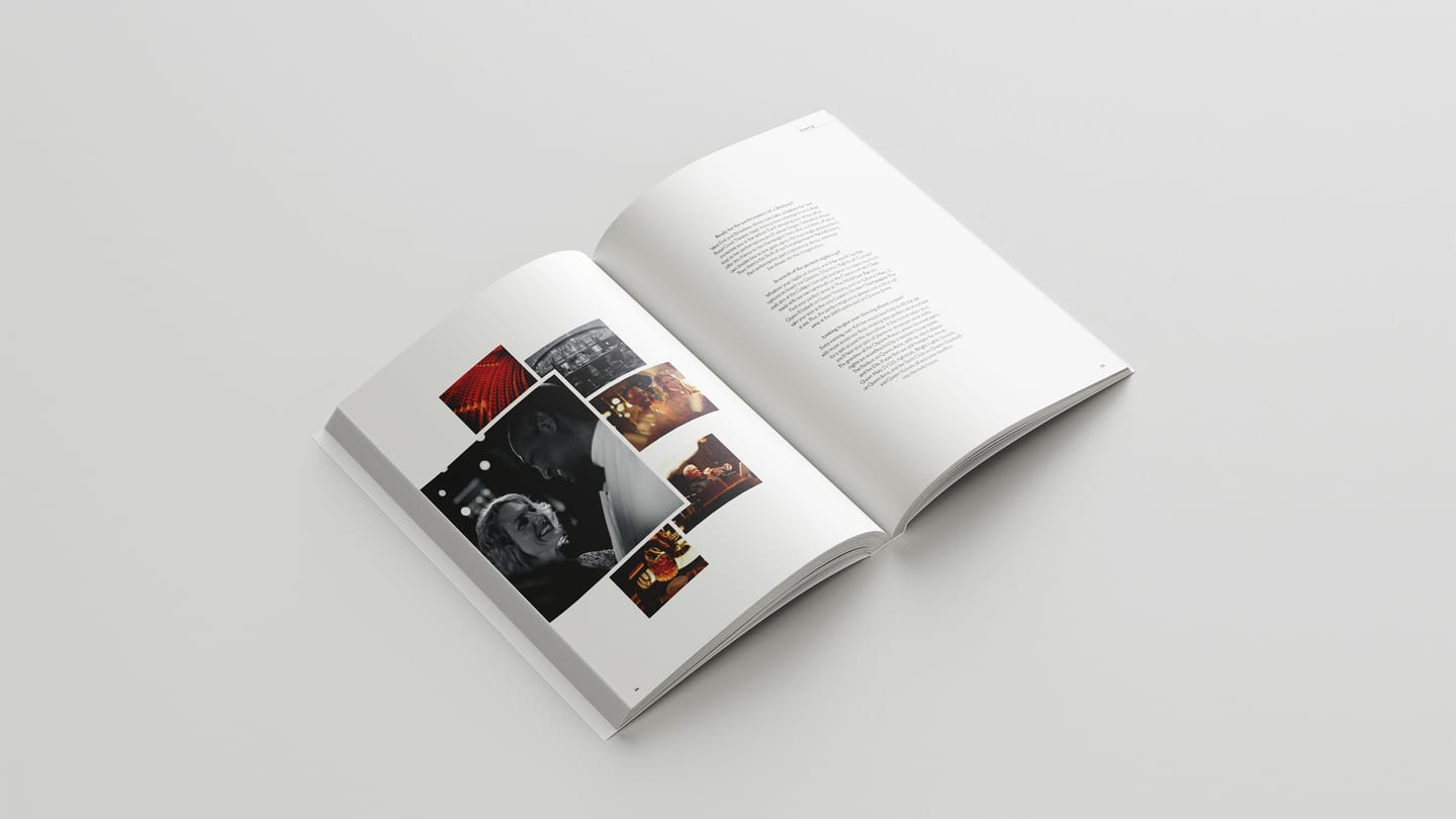
Behind it sits a semi-automated workflow I built to bring hundreds of supplied Excel itineraries into styled, guest facing pages using GREP styling, removing manual rekeying entirely.
Outcome
Proofing amends on itinerary pages reduced by around 95%.
Eight editions delivered on schedule. The brochure remains one of the biggest contributors to the success of new product launches. On a travel agent shelf where everything else is photography led, the embossed and foiled cover is what makes ours the one people notice and pick up.